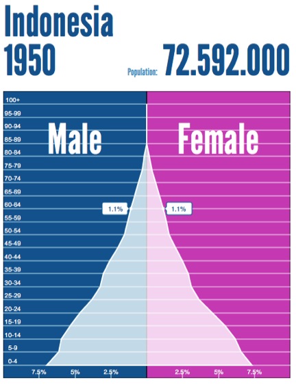
As we can see by the mountain shaped graph, Indonesia had a huge spike in the child population in the 1950s.
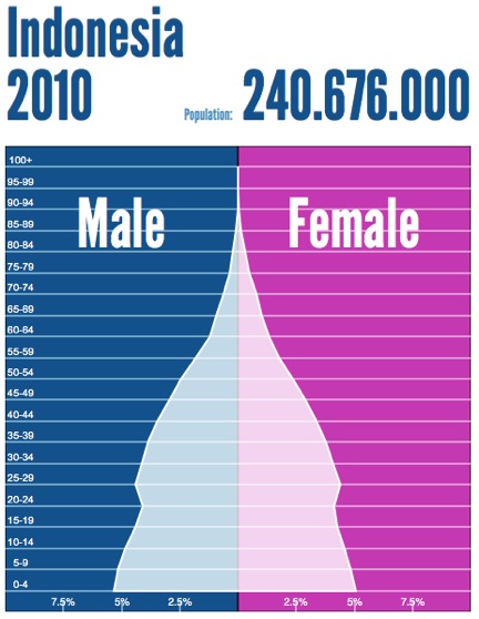
Compared to the 1950s pyramid, this graph in 2010 has evened out a little more. This is because the children on the '50s are growing up and more kids are still being born.

